What do you value most about publishing with Outskirts Press?

Leading up to our August 1 re-launch as the New & Improved Outskirts Press we conducted some market research by asking a select cross-section of our published authors what single thing they valued MOST about publishing with Outskirts Press.

Here are the top five answers:

survey-graphic1

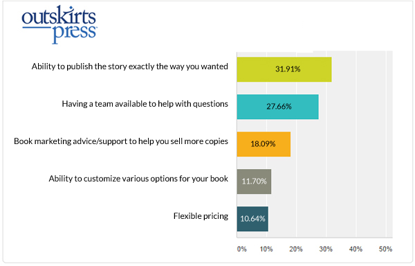
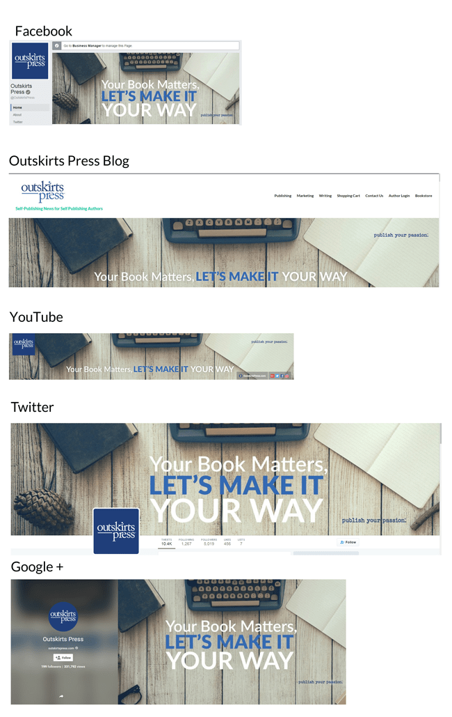
Nearly one-third of them said they most appreciated the ability to publish their story exactly the way they wanted.  So overwhelming was this response that we made it a part of our new brand-promise: “Your book matters, let’s make it your way.”   You can see this brand message across many of our social media platforms, including Facebook, our blog, Google+, and YouTube.

In close second, our authors indicated they highly valued the publishing team that was provided to them to help them throughout the publishing process.  This has always been one of our core offerings, as you can see here, so it was nice to see it so well appreciated by our clients.

Coming up third was our book marketing advice and support.  And while nearly 20% of the respondents indicated it was the single most important component of publishing with Outskirts Press, we made a commitment to offer even more!   All new authors who begin publishing with the One-Click Suites, or the Ultimate or Full-Color after August 1st receive a Book Launch Kit, which contains:

  • The 7 Tactics of Successfully Published Authors
  • The Book Marketing RoadMap
  • An Official Certificate of Publication
  • The 28 Day Book Launch Calendar
  • The Book Marketing Bookshelf

I’ll discuss each of these Book Launch Kit components in future postings, beginning with the all-new Book Marketing Bookshelf, which, beginning today, becomes available for all our published authors inside their Publishing Center. You heard it here first, and more details are coming up next time…


The New & Improved Outskirts Press Newsletter

Last week when I blogged about our Best Book of the Year process, I mentioned that some pictures from the August 20th EVVY Awards would be posted on my blog soon.  The pictures I referred to were those taken by the CIPA photographers (I smiled for so many pictures as I accepted our authors’ awards that my jaw was literally beginning to hurt), and I figured they would be made available any day. I spoke too soon.

So rather than wait for their pictures to be posted, we used some of our own photographs that we took that night to complement our September 1st Newsletter article about the Best Book of the Year Awards.  It was a fitting debut, since this is also the edition that is unveiling our new & improved newsletter, with a better format and better content. You can see the new newsletter here.

“New & Improved” is a phrase we’re throwing around a lot lately, as we improve our branding, our messaging, our packages, our website, our communications, and now our newsletter.  But I feel in every instance of “new” those elements of our company have also been significantly “improved.”

  • Our branding is improved by being more on point with clearly defined colors, fonts, and language.
  • Our messaging is improved by being more helpful and author-orientated instead of “sales-y.”
  • Our packages are improved by including more elements our clients over the past decade have asked for.
  • Our website is improved by being responsive to all devices, being less cluttered and more cutting-edge.
  • Our communications (namely email) are improved by being more focused, more helpful, less sales-y, and responsive.
  • And our newsletters are improved by bringing all those previously listed improvements together.

The first newsletter is a good example of this, where you can clearly see the results of the brand and messaging overhaul. You can also see how we are providing free tips (in this case, an article about creating the perfect book title), and sharing more details about the amazing people behind the scenes at Outskirts Press, beginning with our Director of Operations, Wendy.

Noteworthy perhaps, is what the online newsletter doesn’t include.  The emailed version includes other articles and advice that are only available by subscribing to it or publishing with us (we send out two different versions — one for potential authors and one for published authors; and of course, the content is different, because a published author requires different information than a soon-to-be-published author). The online version, on the other hand, includes only portions of each emailed newsletter for the general public.

newsletter0916

And now that we’ve officially announced the upcoming Best Book of the Year awards, it’s time to choose our 3 finalists! They’ll be revealed next week on our blog. Stay tuned!


Social Media Branding

All this week I’m discussing the New & Improved Outskirts Press, which began on August 1 with the unveiling of our new RWD website for new authors (see below), new packages for everyone, and new inclusions with all new services (like more free galley revision rounds, more free image insertions, Publishing Tip Sheets, the Book Marketing RoadMap, and a responsive Author Webpage for every new author).

13906658_10153610270456105_8658042380025171303_n

I’ll discuss all the new packages and new inclusions, beginning with the One-Click for Non-Fiction Suite tomorrow, but in the meantime, this new branding effort extends past our own website at OutskirtsPress.com and incorporates all our social media channels and platforms, all of which are available @outskirtspress on their respective sites, with the exception of the Outskirts Press blog, which is at http://blog.outskirtspress.com.  And, the exception of Google+, which for some reason insists on making their naming convention different from everyone else by adding a + sign.

branding

In case the message isn’t clear, we passionately believe your book matters, and we’ll make it your way at Outskirts Press.

We still have Pinterest and Instagram to go. But as they say… Rome wasn’t built in a day.  Stay tuned!


5 Years of Author Testimonials

Over five years ago (On April 9, 2011 to be exact), we started publishing author testimonials on our “Author Testimonials” blog at http://selfpublishingauthor.wordpress.com.

Jeff & Shirley Lawrence published their book, Hollywood Be Thy Name in 2006 with Outskirts Press, and, like most of our authors, enjoyed the experience so much they gave us a glowing review:

“We did a considerable amount of research before selecting Outskirts Press. We cannot tell you how pleased we are with the outcome. The book is beautiful. There is a big difference in on-line publishers. They are NOT all the same. We know other authors who made wrong choices and regretted it afterward.”

In the years between 2006 and 2011, we published thousands of additional books and received thousands of additional testimonials from happy authors. But it wasn’t until the launch of our Author’s Testimonials blog in 2011 that we could easily share those comments with other writers.

Now, the Author’s Testimonials blog offers published authors a platform to spotlight their book and their publishing experience, while also offering prospective new clients a chance to hear first-hand how publishing a book with Outskirts Press is a rewarding, and often life-changing, experience!

In the shadow of the imminent Outskirts Press Upgrade on August 1, the Author Testimonials Blog received an update this week, like my blog did a number of weeks ago. I think you’ll agree the new “blog theme” makes it extremely fast and easy to scroll through the thousands and thousands of satisfied Outskirts Press authors and see their amazing books and hear their amazing stories.

And isn’t that what a blog geared toward highlighting author success stories should do?


OUT with the old, in with the NEW

This post combines the two most recent “blog series” postings I’ve been covering over the past year.  The first series has discussed our milestone achievements in relation to our upgrading to Responsive Web Design, which I began discussing last September with this definition of RWD.

In the next post, I defined the 6 milestones we identified at Outskirts Press as we upgraded to RWD, and those milestones were:

  1. Landings Pages
  2. Email Communication
  3. Newsletters
  4. Author Webpages
  5. Outskirts Press External
  6. Outskirts Press Internal

Then, over the next 6 months, I posted about each milestone in order, finally coming upon #5 on June 23rd with the revealing of our new RWD External Website for new authors.

As I’m prone to do, I then switched gears and posted several times about how the new RWD site launch, scheduled for August 1, is related to a new branding strategy and how it all ties together for the exciting rebranding and launch of the *NEW* Outskirts Press.  That was the second “blog series”.

Now, to tie them both together, today I will discuss how the new branding will start to reveal itself to our current in-progress and published authors on the Internal section of the Outskirts Press site throughout the month of July as we get closer to August 1st.

The “internal” portion of our website is affectionately known as either the “Author’s Center” or “Publishing Center”, and is what all our clients see if they have published a book with us, or are currently in the production process.  For technical reasons beyond the scope of this blog (and my understanding), migrating the “Internal” portions of the Outskirts Press site to RWD is a huge undertaking, due to the programming complexity of what the Publishing Center is “doing” for our clients and their books.  But that doesn’t mean we can’t start to apply the *NEW* branding for our current clients.

For instance, this is a snapshot of the “current” Outskirts Press Publishing Center masthead as it looked as recently as July 1:

By comparison, the masthead on our new RWD site is much cleaner:

So as we begin to ramp up the new branding for our new relaunch, our current and published authors will see this version of the masthead below in their Publishing Center when they return from their 4th of July festivities:

The change of the logo from horizontal to vertical is moderate, but the removal of the “blue background” is quite a departure, as it has played a role in our website look for years. By “baby-stepping” these aesthetic changes to our current clients, we hope to avoid as much confusion as possible.  In the coming weeks, we’ll also start to see the “communication” we are employing to notify our potential clients, in-progress writers, and published authors of these exciting changes through our various social media (and direct communication) channels.  Stay tuned…


The “O” is for Outstanding, Part 2

We’re in the middle of the blog series about the “upgrade” or “relaunch” or “face lift” that Outskirts Press is receiving throughout the summer, most notably on August 1, when a whole new website for new clients debuts.  My June 23 posting introduced a screen shot “mock-up” of the new RWD-enhanced website for the first time.  I followed up with some of the branding improvements, and then in my previous post, discussed the “O is for Outstanding” element that will start to play a subtle and not-so-subtle role in our *New* Outskirts Press.

icon-plain

A perfect example of this is the new graphic appearing on all our social media channels today, July 1, announcing our most spectacular discount of the year — an instant 20% savings on our industry-leading ultimate Diamond package or our full-color Pearl package. It’s only good through July 5th.

Just enter promotion code SAVE20 in your shopping cart at check-out. Since the new Outskirts Press on August 1 introduces new packages and new prices, this is absolutely your last chance to get the best deal we will ever offer on two of the best publishing services in the business.


The “O” is for Outstanding

We’re in the middle of discussing the *NEW* Outskirts Press rebranding and relaunch. The rebranding process is already underway, as we’ve been discussing over the past several weeks on this blog. And the relaunch of the NEW Outskirts Press website is scheduled for August 1. With the relaunch comes all new publishing packages, branding, and messaging.

New “stuff” often means new graphics. In the previous post I discussed the impending retirement of our horizontal Outskirts Press logo (we’ll be using the “stacked” version exclusively). Today I will discuss the introduction of the new “O” mark, which will play subtle and not-so-subtle roles in much of the rebranding effort.

icon-plain

Our new suite of publishing service icons will prominently feature this “O” when the new publishing packages are introduced on August 1 on the new website (more on our new packages in the near future).  This “O” will also play a small role in the graphic design of some of our advertising efforts, both online and offline, as we roll out new advertising and marketing campaigns.

You can see the “O” being implemented already, as the new .ico image for our current website at http://outskirtspress.com:

icoblog

If your own website doesn’t yet have an .ico image, it’s easy enough to add one. Simply create a high-resolution graphic (1200 or 2400 dpi) in .jpg or .png format, and then use an .ico converter on the web (easy enough to find with a Google search) to convert the image into .ico format. Then upload that .ico file to your website’s root directory.  It’s a small thing. But in the world of self-publishing, small things often make all the difference. Which is why Top Consumer Reviews ranks Outskirts Press #1.


Branding the new Outskirts Press

In my previous post, I announced the *new* Outskirts Press, which is scheduled to launch on August 1 with a new website for new authors, and new branding and new packages for everyone. As we gear up for that exciting launch, some new branding will start to “trickle” into our other online presences, beginning with this one.  For frequent readers of my blog, you know that “branding” is a common theme of my posts, and one goal for the launch of the New OP is consistency across all our various online channels.

So yesterday marked the launch of the new BrentSampson.com blog theme, and I’ll discuss a number of components of that theme today, so as additional Outskirts Press sites across the Internet re-brand themselves, those who are playing along can see what goes into a rebranding strategy.

I’ve taken a screen shot of this new blog, and I’ll discuss the following elements:

The first circled element is our trademarked logo.  We introduced this stylized dark blue/light blue logo back in 2010 in two iterations: a stacked version, like the one you see circled here, and un-stacked, horizontal version, in which “outskirtspress” ran together:

new-logo-72-h

Say good-bye to that horizontal version. Part of our rebranding exercise is using one consistent trade-marked logo everywhere — the “stacked” version.   The logo and placement on my blog also matches (as closely as WordPress allows) the placement on our new website when it launches later this summer:

If you look to the upper-right of both images above you will see a menu that offers links to our shopping cart, our contact us page, our author login page, and our bookstore, respectively. Those links are duplicated on this blog, along with the main menu choices from the new website (publishing, marketing, and writing services).  Until the new site launches, those links on my blog go to the current versions of all those pages.

Outskirts Press operates four different, active blogs, and the arrow on the left of the image above points toward the “title” that will designate the brand-identity of each blog when they each re-launch with consistent branding over the next several weeks.   Also acting as a “brand-identity” is the photograph in the right column of this blog, which the second arrow is pointing to in the image above. In my case, it’s an updated picture of yours truly (the last one was taken in 2002, so I figured it was time for an update).

The last remaining element is the red box, which is a place-holder for the “header” image.  The new RWD Outskirts Press website will feature a rotating header image that features our monthly publishing, marketing, and writing promotions (as demonstrated by the “Save 10% on Amazon Look Inside” in that mock-up image above).   Will those monthly same images play a role in the branding of our various blogs in the same “header space”?  Stay tuned to find out.


Announcing the *NEW* Outskirts Press

Before I got sidetracked discussing the recent Colorado Book Awards, the new edition of Sell Your Book on Amazon for 2016, and the publication of my newest book, The Book Marketing COACH,  I was in the middle of a series of postings about our methodical transition to RWD (responsive website design), in which I outlined six milestones.

Those milestones were:

  1. Landings Pages
  2. Email Communication
  3. Newsletters
  4. Author Webpages
  5. Outskirts Press External
  6. Outskirts Press Internal

I covered milestones 1-4 as we completed them, finishing with the launch of the new Outskirts Press Author Webpages in glorious RWD.

That brings us to the 5th and most exciting milestone, the launch of the “external” Outskirts Press website, which is scheduled for August 1, 2016.

While current authors will continue to see the current version of the website (if they are logged-in), new clients who start publishing with us in August will see the all new Outskirts Press website, which will look like this on their desktops when it goes live:

And, as with all RWD sites, the new Outskirts Press website maintains its appearance and ease-of-use across all tablets and smartphone browsing, too.

August 1 brings with it more than just a modernization of our website. It introduces the brand *NEW* Outskirts Press, brought up-to-date in this fast-moving industry with all-new publishing services, all-new branding, and an even deeper commitment to helping our clients publish the book of their dreams with personal service and quality products. More on that in the near future.

But first, over the next several posts, I’ll discuss that “all new branding” component in further detail, beginning with what frequent readers of my blog may have already noticed — an updating of all our blog themes across social media, beginning with this one.  More on that next time…

Authors can upgrade their webpages to the 21st century!

Over the past several posts I’ve discussed RWD (responsive web design), and the milestones Outskirts Press has identified as it transitions all its web properties to RWD. Today I’m pleased to announce that all our published authors can easily and quickly upgrade their current author webpages to RWD.

mobile-upgrade

In my last post I detailed the 13 cool features of the new RWD upgrade. But the easiest way to see how the upgrade looks and works is to take a look at it for one of our Fandemonium books.  Be sure to check it out on a desktop, your tablet, and your smartphone, and you will see why RWD webpages are the wave of the future: it’s like having a regular webpage, a mobile site, and an “app” for your smart phone all at once!

If you’ve published with Outskirts Press, upgrading your author webpage (or webpages, if you’ve published multiple books) is as easy as clicking here.