Facebook increases avatar graphic size

Figures.  Gotta love Mark Zuckerberg and his tendency to “change” things on Facebook at the drop of a hat.   I had just finished sharing suggestions for optimizing your cover graphic for the new Facebook Timeline when Facebook decides to increase the size of the “logo” that is superimposed over the Cover graphic.  If your cover graphic isn’t/wasn’t precisely optimized in accordance with some of my recommendations, this size difference probably wasn’t even noticeable. However, if you had created your cover graphic down to the pixel, as we had at Outskirts Press, this new avatar size resulted in overlapping actual content on the underlying cover graphic, as circled in the sample image below.  See how some of the words in our “Calendar” for April were covered by the increased size of the Avatar box?  Not great…

The size of the logo/avatar box increased from 133 pixels wide to 168 pixels wide. Naturally, you would want to make alterations to your cover graphic as a result, as we did with this new graphic that we launched on May 1st.  We actually plan to upload a new cover graphic on the first day of every month, anyway, since our two “Calendar” boxes draw attention to the current month’s activities/events/promotions on Facebook as well as “tease” the upcoming month’s. For instance, in June we will be crowning the author of our 2011 Outskirts Press Best Book of the Year.  And I’ll be discussing that in more depth soon, but in the meantime, here’s the next cover graphic for Facebook, with the new avatar size accounted for, and the update to the Calendar. Of course, it had to be “shrunk” since the optimal size for the cover graphic is wider than the space allowed by this blog template, and you’ll notice that we simply leave the portion of the graphic unfinished where Facebook superimposes the Avatar (details, details), but you can see how it looks for real on our Facebook page at http://facebook.com/OutskirtsPress.


Getting the most out of your ABOUT BOX on Facebook Pages

With the Timeline theme on Facebook pages, the “About” box is more important than ever.  Yes, the “cover graphic” allows you to brand your page, but according to Facebook parameters, your cover graphic is not allowed to contain a URL.  Fortunately, the About Box allows them, so be sure to take advantage of that.  And, the good news is, FB automatically turns any URL that you include there into an active link that actually goes to your company website. It’s a valuable piece of real estate that you don’t want to waste, so word your “About” box in such a way to leave room for your URL to appear (rather than being truncated).  This means your About text needs to be approximately 20 words long, since you have a maximum of 3 lines to include both your About text and your URL.  In the case of Outskirts Press, our About language is the following, which fits exactly into the allocated space in the About box:

Outskirts Press offers full-service, high-quality, custom book publishing and marketing services. Keep 100% of your rights & royalties at www.OutskirtsPress.com.

What we offer, our benefits, and our URL. Short, sweet, effective.

To the right of the About box are the 4 app navigational boxes. I call them navigational boxes because if you manage them effectively, you can treat them like website navigation, taking your Facebook users to other pages of your Facebook presence, where each page can then be customized to accomplish tasks the main timeline page can’t do very well (ie, sell or market your stuff).  We’ll discuss that next time…

Facebook Timeline Cover Graphics

In yesterday’s post I mentioned the three things to consider when creating your “Cover” graphic for your company FB page now that the Timeline theme has removed the ability to have “Welcome Pages.” Those three considerations are

1) Identify your company’s core benefits 2) Incentive ”Likes” in a similar manner to the previous Welcome pages 3) Aesthetically design around the FB elements that are super-imposed over the cover graphic

As a result of these three goals, here is the cover graphic we created for Outskirt Press (it might be a little “squashed” since the optimal width for this graphic is 851, which exceeds the amount of space available on this blog. Nevertheless it gives you the idea, and you can see the “real” cover graphic on our Facebook page by clicking here.

In our case, our core benefits are that we help authors write anything, publish everything, and market everywhere. So those benefit statements are a part of the design.

We incentivize links by highlighting the current months “perk” or “topic” along with the next month’s upcoming topic, and then we graphically point in the general vicinity of the “like” button of FB, as well-designed “Welcome” pages did in the past.  By referring to both the current and up-coming months, we give incentive for friends to “stay with us” even if the current month’s event/promotion is nearing the end.  And finally, we designed this graphic to aesthetically accommodate the FB lay-overs.  The “white space” underneath the couple is where Facebook overlays the avatar graphic, so we matched the treatment of that graphic, even down the 3 pixel border separating the gray lines from the image.  So it actually looks like this on Facebook:

And that brings us to the rest of the header space: the “About box, the photos, and the other three “navigational” graphics FB allows. We’ll discuss more of that next time…

Creating a Cover image for Facebook pages

I mentioned in yesterday’s post that these were the 4 “requirements” when creating a new “Cover” image for the Facebook profile pages within the Timeline framework:

  • It should be at least 399 pixels wide, but 851 pixels wide is better and 315 pixels tall is recommended.
  • It cannot feature pricing or discount/promotional information.
  • It cannot contain contact information or website addresses.
  • It cannot contain call-to-action statements.

When creating your 815 x 315 pixel graphic, there are some other considerations.  For one,  your avatar is going to appear as an overlay in the lower left hand corner of the graphic, starting approximately 20 pixels from the left edge and 75 pixels from the bottom edge. The box that superimposes over your graphic is 135 pixels wide. So in other words, you shouldn’t put anything important (definitely not any words) in the lower left corner of your graphic, which is defined by a space of at least 160 pixels wide by 90 pixels high. In fact, if at all possible, you should try to “incorporate” this avatar graphic within the design aesthetics of your Cover, in order to give the impression that both elements are a part of the same graphic.

The other area to consider is the upper right hand corner.  For users who are not signed-in to their Facebook account (or don’t have one yet, if there are any of those people left), Facebook overlays a “Sign-up box” over your Cover graphic.  The simplest thing to do, of course, is to not worry about this (and given the spacing variables that arise, depending upon whether this pop-up box appears on a mobile phone, tablet, or monitor, that’s also perhaps the most realistic option). The second easiest thing to do is refrain from putting any content in this area of your cover graphic. But considering the size of Facebook’s Sign-up Box, that’s a lot of real estate to “give-up” just for those people who aren’t signed in.

A trickier, but ultimately, perhaps, more successful approach, is to design some content to fit within the designated space, so that your cover graphic looks complete both with and without Facebook’s overlay. Trickier still, Facebook’s overlay is somewhat transparent, so you cannot have anything BOLD and BRIGHT under it.

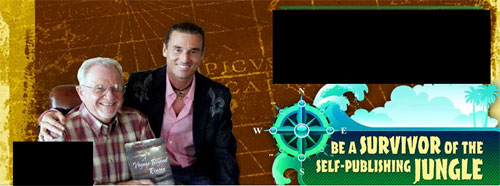
In our first attempt at a cover graphic, we added a testimonial in that space.  The graphic (let’s call it our “Survivor graphic” for the sake of identifying it among other graphics) stands on its own when Facebook’s overlay covers our testimonial, and when the overlay is gone, the testimonial supports and further enhances the graphic.

So, given those considerations, and our first opportunity to deal with this new branding opportunity, our first attempt at a cover graphic featured one of our authors holding his book alongside his friend (and subject matter), Benjamin “Coach” Wade from the CBS reality show “Survivor.”

If it helps, below is a graphic representation of the two “trouble spots” I described above, so you can keep them in mind as you design your own compelling cover graphic. The top-right black box is approximately where Facebook overlays their own “Sign-up/log-in graphic” and the bottom-right is where Facebook overlays the “Avatar graphic.”

As we began enhancing other elements of the new Timeline masthead, this Survivor graphic was replaced with something else, and we’ll discuss that next…

How to create a “Cover” for the new Facebook pages

Now that the new Facebook Pages and its timeline motif have been thrust upon all of us recently (and don’t think you’re exempt if you don’t have a Company page; personal profile pages will be forced into the Timeline on April 15th), we were faced with the task of branding Outskirts Press within the new look.

As you may or may not recall from a Facebook series of posts I wrote a while ago, in which I shared the process of branding your Facebook presence, our Facebook page at Outskirts Press has looked like this for a while:

And then suddenly, it looked like this:

No branding to speak of, really. Fortunately, with the new Facebook timelines, you have the option of creating a “cover” to your Facebook profile page.  Here are some rules to keep in mind when designing your own cover (which is just FB’s fancy way of referring to a main graphic).

  1. It should be at least 399 pixels wide, but 851 pixels wide is better and 315 pixels tall is recommended.
  2. It cannot feature pricing or discount/promotional information.
  3. It cannot contain contact information or website addresses.
  4. It cannot contain call-t0-action statements.

In other words,  it can’t contain any of the elements normal marketers use to, you know… sell stuff. But it can be designed to brand your page, and then through various tweaks to the timeline itself, you can move some of those promotional tactics elsewhere. I’ll tell you how as we continue this series of posts…

Customizing new Facebook pages

Since it could have easily been confused for an April Fool’s Day joke, Facebook decided to change all the Company Pages to the “Timeline” motif at the end of March, but certainly the close proximity to April 1st is not just a happy coincidence.  For entrepreneurs or companies that have spent a lot of time tweaking their Facebook profile and company pages to get them just right, having to start again from scratch is a little annoying. Note to Zuckerberg: Your hobby doesn’t have to become our hobby.  In all fairness, this change seemed inevitable because I’m sure the “old” way was overloading their servers.  The “Timeline” presentation of data is much more efficient in terms of server access for its approximately 500 million daily users.

Okay, so now that the change is upon us, in the coming days I’ll share some tips and tricks to help you change your page from looking like this (which is what ours at Outskirts Press looked like on April 1 – April Fools indeed)…


… to looking like this…


Facebook fan leader boards and “Fan of the Week” kudos

I know I should be discussing the proofing process at Outskirts Press, and I will get back to that next week, but in celebration of our passing 5,000 fans on our Outskirts Press Facebook Page, I wanted to mention some of the new apps we added to not only encourage more participation from our FB friends, but to give them recognition for that participation, as well.  Of course, anything that I discuss regarding Facebook is a little up in the air, since apparently, the Fan Pages on Facebook will be changing to a new design on March 30.   But if the “Preview” is to be believed, this new design will incorporate the oft-debated “Timeline” design that Facebook unveiled for the Personal pages a little while ago.  This re-design shouldn’t affect what we’re doing with our Fan Recognition Programs, which I’ll discuss now:

The first is a “Fan of the Week” award, which will publicly recognize a random fan of our Facebook page for participation on our wall — which gives public kudos to fans who have actively engaged in liking something, commenting on something, or posting something.  Each week, a new Fan will be chosen, recognized on our wall, and will be featured on a new Fan of the Week page on our Facebook Page, with his/her user profile “up in lights.”  The purpose, of course, is to encourage other fans/friends to participate, so they will become the next Fan of the Week. The more you participate, the greater your chances to be chosen as the Fan of the Week.

To that end, we also launched a Top Fans app, which goes one step further.  Every Sunday we will recognize the top weekly fans who are responsible for the most likes, the most comments, and the most posts.  The top 5 fans in each category will be listed on a new Top Fans leader-board page, along with a 4th category, recognizing the fans who have accumulated the most “points” overall (with certain engagements — likes, comments, posts — earning a certain number of points).

And in the coming months we will be launching our Facebook Publishing Awards, where certain milestones our authors reach in the publishing and marketing process are automatically broadcast to all their Facebook friends.   People closely watching my personal FB page may have noticed the first such Award come across my newsfeed a couple of weeks ago.  This will be a great way for us to help our authors better establish and earn the public recognition they deserve for their impressive accomplishment — successfully publishing and marketing a great looking, high-quality book!

And if there’s any doubt that all this “stuff” I’m talking about in regard to Facebook (including the tactics I covered yesterday) contribute to significant increases in social media “reach,” one need only look at this recent graphic generated by Facebook Insights for our Facebook Page:


Designing a Facebook Welcome Page – Part Six

There’s only one main graphic element remaining to be discussed as we talk about the current Outskirt Press Facebook welcome graphic and its creative elements. The creative component is “phase 1” of a 3-4 week series about how to creatively design a “Facebook Welcome Page” and then how to technically create it within Facebook. We’re almost done with the creative part.  In fact, there’s only one more graphic left. (Well, there are actually two, but the last graphic is just a small element to complete the very bottom part of the vertical banner.). Tomorrow I’ll reveal the whole Facebook welcome graphic in its entirety,  Of course, you’re welcome to cheat by going straight to our Facebook Page and, if you’re not a fan/friend, yet, you’ll see our Welcome page.   

Our Welcome graphic is composed of rolling monthly opportunities, promotions, incentives, or perks. We discussed the general giveaway, concerning the Barnes & Noble NOOK last week, and we discussed January’s event (Fandemonium Volume 2) yesterday.   Our graphic will show two months at a time.  That means, on February 1, the January graphic will go away, February will move “up” and the March monthly event or announcement will drop neatly into place.  One general suggestion to keep in mind when it comes to incentivizing Facebook links is to KEEP giving your friends/fans valuable promotions or content above and beyond whatever prompted them to join in the first place.   Many of our current fans “liked” us on the chances they would win an Amazon Kindle last Christmas.  Only one could win.  So what do you do, as a business, an entrepreneur, a marketer, or an author, to keep those fans from “unliking” you once the giveaway is over?   You keep giving them value.  In our case, we kept the giveaway going, and even upped the stakes for a NOOK, but we also gave them a chance to publish for a free in a Facebook anthology.

And, in February, we’re giving them the chance to win a free Apple iPad2:

We don’t reveal too much more than that in our Facebook Welcome graphic — just enough to whet their appetites and hopefully get them to “like” us, if they haven’t already – or to get those who have already “liked” us to stick around for a couple weeks on Facebook.  By that time, hopefully, they’ll have come to see our value as a book publishing and marketing firm and we’ll have earned their business when they’re ready to publish.

And that, in short, is an example of how you can use Facebook to build relationships with your potential clients/customers, regardless of whether you are a start-up, a corporation, or a published author.

Facebook landing page

I know I promised to talk about how to create a Facebook landing page, and I will, although that topic will probably have to wait until January. Because tomorrow’s posting is going to be a follow-up to the recent posting regarding Hootsuite and Google + pages for business and then for the next two weeks I’m going to do a series about the funniest contractual clauses I’ve read in other self-publishing agreements. Seemed like a good Christmas series of postings…

But, speaking of Christmas and of the Facebook landing pages topic that I’m pushing to January, I thought I would at least share our current Facebook landing page for Outskirts Press. Hey, you too can be eligible to win an Amazon Kindle, and perhaps even a Barnes & Noble Nook or an iPad 2.  Here’s what our landing page looks like (well, without the actual “Like” button, which is where Facebook comes in when you visit our page.)


How to automate social media postings for Facebook, Google+ Pages, and more

Yesterday I finished the blog series about creating a Google+ page for business by suggesting that with this post, today, I would share a method to automate posts to Google+. And before I do that, let me dispel the notion that “automating” posts is any sort of “click it and forget it” type of thing.  The task (yes, it’s a task) of “automating” your social media presence still requires a fair amount of work. For instance, for the purposes of maintaining our growing social network communities for Outskirts Press, we use the following “automation” and tracking tools: TweetDeck, HooteSuite, Klout, Ping, Rooster, and FTTT.  And to give you a visual representation of what all that involves, here’s a screen shot of JUST our HootSuite dashboard:

Scary, yes? Helpful? You bet!  In this particular screen shot, if you squint closely, you may notice that we are able to monitor 5 social media “streams” simultaneously, plus we’re able to post directly to our Facebook page, keep track of retweets from Twitter, and even schedule posts in advance on a few of our networks all at once. Unfortunately, no single application that I’ve been able to find has access to ALL the social media networks that we use, which is why we have several (and of course, that sometimes causes scheduling conflicts where several of us at Outskirts Press may inadvertently schedule various posts too close to one another).   And up until very recently, NONE of them automated posts to Google+ Pages (simply because Google+ Pages are so new).  But within the last couple of weeks, the API was opened up to six applications, including Hootsuite.

Sounds too good to be true?  The ability to automate posts and content to our new Google+ Page using an application we were already familiar with and using heavily? Well, right now, it IS too good to be true.   Development of new functionality like this takes time and even though Hootsuite has the Google API available, they don’ t yet have anything operational on their dashboard. Instead, they direct you toward a “landing page” requiring you to “apply” for the benefit of having Google+ added to your dashboard.  Here’s a link to the application.

So until it is officially added to Hootsuite — or to the others, which are: Buddy Media, Context Optional, Hearsay Social, Involver, and Vitrue– this is the procedure for putting the steps into place to be able to automate your Google+ pages as easily as your other social channels.  Of course, you might get hit up by some marketing emails from Hootsuite or even sales calls, so… just sayin’.

I’ve applied and will keep you posted…

Speaking of landing pages, today also marks the beginning of our  new Facebook landing page to encourage more “Likes” to build our Facebook community, which surpassed 3,000 this week.  And I’ll discuss all the fun details involved in creating and implementing Facebook landing pages next…